Top 15 Word Document Accessibility Mistakes That Could Cost Your Business in 2026

Most inaccessible client facing PDFs are born from inaccessible Word documents. Your compliance team might focus on website WCAG audits whilst overlooking the thousands of contracts, statements, policies, and customer communications generated monthly from poorly structured Word templates – filled with mostly common document accessibility mistakes.
When regulators audit your customer documents in 2026, they won’t accept “doc looked fine visually and nobody complained” as justification. But screen readers don’t see visual formatting, and so as your clients with impairments. Assistive technologies don’t rely on semantic structure that most business documents completely lack.
During the accessibility implementation projects, we spotted a lot of faults, but some of them deserve decent attention. Below are the 15 most common and costly Word document accessibility mistakes we spot frequently in banking, insurance, and financial services. Each one creates barriers for customers with disabilities, exposes your organisation to discrimination claims, and once it’s embedded in CCM templates, multiplies across thousands of generated documents.
Understanding these errors can prevent your time and resources spent on penalties, remediation costs, and reputational damage that follow when accessibility failures reach regulators or courts.
Structural Errors: The Foundation That Breaks Everything
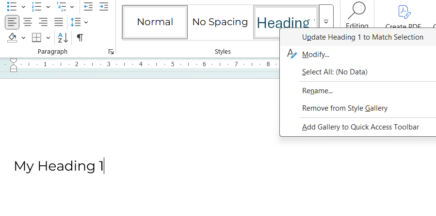
1. No Proper Heading Structure
Walk into any compliance department, and you’ll find dozens of Word documents where headings are created by simply making text bold or increasing font size. Authors skip heading levels, jumping from H1 directly to H3, or scatter multiple H1 tags throughout a single document without understanding the semantic hierarchy this creates.
How Customers with Disabilities Experience It: Screen reader users hear the entire document as one long, undifferentiated text block. They cannot navigate by headings, jump to specific sections, or un derstand document hierarchy. A 30-page policy document becomes an audio marathon with no way to skip to relevant sections.
The business impact extends beyond user frustration. Long contracts, product guides, and policy documents become practically unusable for blind customers, triggering complaints and potential discrimination claims. Under EN 301 549 and the European Accessibility Act, this represents a fundamental failure, not an edge case regulators might overlook.
2. Empty Lines for Spacing
It seems harmless enough: pressing Enter repeatedly to create visual spacing between sections. Yet, this common habit creates a peculiar experience for assistive technology users. Screen readers faithfully announce each empty line as “emptiness”. It makes all the text scope muddling and simply unprofessional.
How Customers with Disabilities Experience It: Screen readers announce each empty line: “blank… blank… blank… blank…” This creates confusion about document structure and wastes time. Users cannot distinguish intentional breaks from formatting errors.
When embedded in CCM templates, this issue multiplies across thousands of generated documents.
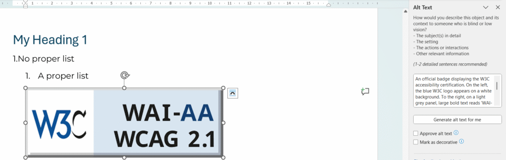
3. Fake Lists Using Manual Numbering
Consider how many business documents contain numbered procedures or bulleted features created by typing “1.” followed by a space, or manually inserting dashes as text characters. Authors avoid Word’s built-in list formatting tools, creating what appears visually as a proper list but contains no semantic structure underneath.
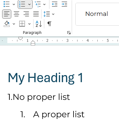
How Customers with Disabilities Experience It: Screen readers read fake lists as continuous paragraphs without announcing list structure. Users cannot navigate list items, understand hierarchies, or know how many items exist. Numbered steps in contracts or instructions become incomprehensible.
This increases support tickets, creates confusion about contractual obligations, and exposes the organisation to claims that critical information wasn’t properly communicated.
Tables: Where Complexity Meets Chaos
4. Over-Complex or Malformed Tables
Tables present unique accessibility challenges, and most business documents handle them poorly. Authors create tables with merged cells to achieve specific visual layouts, nest tables within tables, insert blank rows for spacing, or simply forget to define which rows and columns serve as headers.
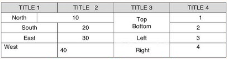
How Customers with Disabilities Experience It: Screen readers track position by counting cells. Merged or split cells break this logic, causing users to hear “cell… cell… cell…” with no context. Financial tables in statements, tariffs, or fee schedules become meaningless sequences of numbers.
For banks and insurers, this creates particularly high risk because core financial information like interest rates, payment schedules, fee tariffs, transaction histories, becomes meaningless sequences of numbers. Customers cannot understand critical financial data affecting their accounts, creating clear grounds for discrimination claims under accessibility law.
5. Tables Used for Layout Purposes
What people do? They use multi-column tables to position text or create visual layouts, rather than for actual data presentation.
How Customers with Disabilities Experience It: Screen readers treat layout tables as data tables, announcing nonsense rows and columns. Content appears out of order, creating a chaotic and fragmented reading experience.
When layout tables appear in CCM templates generating customer letters, every single document becomes structurally inaccessible, and batch remediation for thousands of historical documents becomes prohibitively expensive.
Images and Visual Content: The Silent Barriers
6. Missing or Meaningless Alt Text
Images pepper business communications – charts showing payment projections, promotional banners announcing limited-time offers, process diagrams explaining how services work. Yet most contain either no alternative text descriptions or meaningless placeholders like “image1,” “logo,” or “chart.”
How Customers with Disabilities Experience It: Blind users receive no information about image content. If charts show payment schedules, promotional banners contain deadline warnings, or diagrams explain processes, visually impaired customers never learn this critical information.
This constitutes “information not provided” – a clear discrimination violation under accessibility law. In CCM workflows, the problem often affects marketing banners, legal disclaimers embedded in images, and data visualisations that organisations consider essential communication elements.
7. Text Embedded in Images
Perhaps more problematic still is the practice of embedding text within images – promotional banners designed in graphics software, infographics containing statistics and explanations, or scanned documents where text appears only as part of an image rather than selectable content.
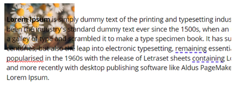
How Customers with Disabilities Experience It: Screen readers see nothing. The document contains blank space where critical information should be. Even sighted users with low vision cannot zoom or reflow text embedded in images.
A blind customer literally cannot read documents your legal team considers as “successfully delivered.” This creates high litigation risk, as organisations cannot prove information was made accessible to all customers.
Links and Navigation: Breaking the Journey
8. Non-Descriptive Links (“Click Here”)
Open a business related document, and you’ll likely find links labelled “click here”, “read more”, or raw URLs stretching across three lines of text. These seem innocuous until you understand how screen reader users navigate documents.
How Customers with Disabilities Experience It: Screen reader users navigate by pulling up a list of all links. When they hear “click here, click here, click here, click here,” they have no idea where any link leads and must open each one blindly to find relevant content.
This affects everyone, not just assistive technology users. Furthermore, this creates particular barriers when regulatory materials, disclosures, and support resources remain effectively hidden behind meaningless link text. Support centre volume increases as customers cannot self-serve using document navigation.
Language and Metadata: The Invisible Foundation
9. Missing Document Title and Metadata
Documents live or die by their metadata, yet most Word files leave property fields blank. When exported to PDF, these become identified only by filename. Often something like “doc_final_v3_really_final.pdf” that makes sense only to the person who saved it.
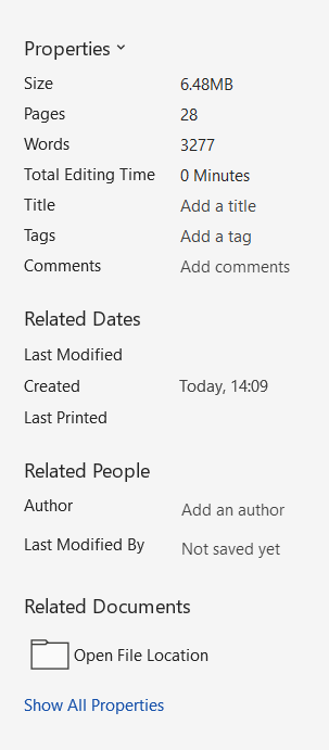
How Customers with Disabilities Experience It: Screen readers announce only the filename. Users cannot distinguish between similar documents in portals or archives, creating navigation chaos and wasting time.
Customer portals become unusable for organising and accessing statements, contracts, or correspondence. During regulatory audits, organisations struggle to prove which documents were provided and when.
10. Wrong or Missing Document Language
European financial institutions serve multilingual markets, yet document language settings often remain on default English even when content contains Polish, French, or German text. Authors don’t mark foreign phrases or financial terms with correct language tags, assuming visual presentation suffices.
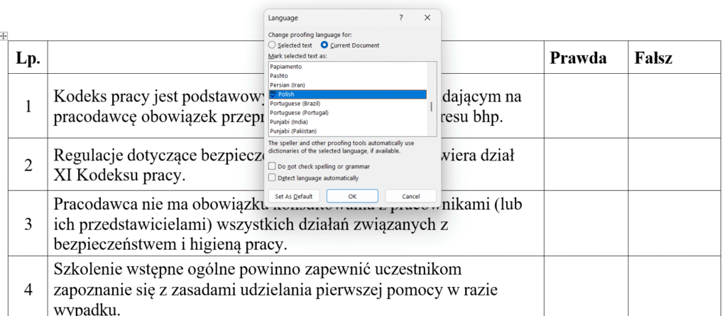
How Customers with Disabilities Experience It: Screen readers use incorrect pronunciation rules, making bilingual documents sound like gibberish. Polish financial terms pronounced with English phonetics become incomprehensible.
For multi-language markets common in European banking, this creates frequent hidden failures. It triggers complaints from language minorities and cross-border customers who cannot understand documents supposedly provided in their language.
Visual Design: When Appearance Excludes
11. Low Colour Contrast
Light grey text on white backgrounds. Text overlaid on decorative images. Font sizes shrinking to 9 or 10 points in legal sections and disclaimers. These design choices create documents that technically contain all required information whilst rendering it functionally invisible to significant customer populations.
How Customers with Disabilities Experience It: Low-vision users see faded shapes instead of readable text. On mobile screens or in bright sunlight, content becomes completely unreadable. People with cataracts or ageing vision struggle with insufficient contrast.
The “small print” becomes literally unreadable, creating extreme risk in contracts, fee schedules, and consent forms where regulators may interpret poor contrast as intentional obscuring of important information.
12. Colour as the Only Indicator
Red text signals overdue amounts. Green indicates approved status. Yellow highlighting marks mandatory fields. These colour-coded systems seem intuitive until you remember that approximately 8% of males and 0.5% of females experience colour blindness.
How Customers with Disabilities Experience It: Colour-blind users see similar shades and cannot distinguish between states. They miss critical warnings, payment statuses, or required actions.
Payment status indicators, approval workflows, and error messages become ambiguous, leading to financial mistakes, missed deadlines, and complaints that create both compliance and operational risk.
Word-to-PDF Export: Where Accessibility Dies
13. Wrong PDF Export Method
Here’s where many organisations trip at the finish line. They’ve invested time ensuring Word documents use proper heading styles, alt text, and semantic structure. Then someone exports the document using “Print to PDF” instead of “Save As → PDF” with accessibility options enabled, and every bit of that structure vanishes.
How Customers with Disabilities Experience It: Despite the source Word document having proper headings and structure, the PDF contains none of it. Screen readers announce: “This document has no headings, no structure.” Users experience long, undifferentiated text blocks.
This represents the most common trap banks and public bodies fall into when implementing EAA compliance. They believe they’re compliant because “we used Word styles correctly”, yet final PDFs sent to customers fail accessibility audits. The visual appearance remains identical, whilst the underlying accessibility completely disappears.
14. Critical Content in Headers/Footers
Account numbers in headers. Reference IDs in footers. Deadlines and contract numbers repeating across every page. This seems logical: important information visible throughout the document.
How Customers with Disabilities Experience It: Many screen readers skip headers and footers entirely or read them inconsistently. Critical information becomes invisible, even though it visually appears on every page.
Customers cannot find reference numbers needed to call support, account identifiers required for transactions, or deadlines for contract actions. This generates complaints and increases support centre volume.
15. Justified Text Alignment
Apply full justification (flush left and right margins) because it “looks professional and clean.”
How Customers with Disabilities Experience It: Justified text creates uneven spacing between words, making it difficult for people with dyslexia or cognitive disabilities to track lines. The irregular spacing disrupts reading rhythm and comprehension.
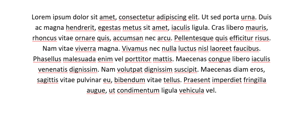
Long contracts, policies, and product documentation become harder to read for a significant portion of customers. This increases abandonment rates and reduces comprehension of important terms.
The Template Multiplication Effect
We are happy you went so far, and now you can see the broader perspective on how inaccessible documents and templates create back and forth both for operations and clients. Here’s why these document accessibility mistakes matter more than you think: when document accessibility mistakes exist in CCM templates (Quadient Inspire, OpenText Exstream, or similar platforms), they multiply across every generated document.
One inaccessible template generating 10,000 monthly bank statements = 10,000 compliance violations monthly, which can lead up to 120,000 violations annually.
At €1,000 per violation (conservative estimate based on Swiss and Norwegian precedents), that’s €120 million in potential exposure – from a single broken template.
Manual remediation at €15-30 per document would cost €1.8-3.6 million annually just to fix outputs from one template. Meanwhile, fixing the template once costs €5,000-15,000—a 99% cost reduction.
This is why template-based accessibility is the only sustainable approach for document-heavy organisations.
Tiding Up the Accessibility Before 2026 Audits Season Begin
- Audit Your Word Templates: Start by auditing your Word templates rather than assuming documents are accessible because they “look fine visually.” Microsoft’s built-in Accessibility Checker catches only 30-40% of issues, so commission professional audits that include manual testing with actual screen readers and assistive technologies.
- Fix Templates, Not Individual Documents: Focus more remediation efforts on templates rather than individual documents. Remediate PDFs and ready documents, which your organisation uses “forever”.
For CCM platforms, fixing accessibility at the source means one accessible template generates unlimited compliant outputs, eliminating recurring remediation costs that would otherwise compound monthly. - Train Content Creators: Business analysts, compliance officers, and document designers must understand accessibility requirements. Budget 40-60 hours per person for proper training on accessible document creation, understanding this as infrastructure investment rather than overhead.
- Validate Export Processes: Validate your export processes to ensure Word-to-PDF conversion preserves accessibility tags and semantic structure. Test with actual assistive technologies like PAC 2024, screen readers, and keyboard navigation rather than relying solely on automated checkers that miss contextual problems.
- Document Your Compliance: Document your compliance efforts meticulously. Maintain records of accessibility audits, remediation work, and testing results. Regulators increasingly demand proof of proactive compliance efforts, rather than reactive fixes implemented only after complaints arrive.
Ready to audit your document templates before regulators do? We’ve detailed the complete implementation process in our latest case study: EAA-Ready Document Communications for Banking, where a leading Polish bank implemented accessible templates at scale.
Contact us for a Word template accessibility audit or explore our comprehensive PDF accessibility services designed specifically for financial institutions facing EAA compliance deadlines.
Let’s drive your Digital Transformation Together.
Schedule a free consultation with our team to explore how we can help you achieve your goals.
See also

Migration Made for You: Quadient vs OpenText Comparison. Which CCM Does More for Your Business?

How PaaS Enables Scalable & Controlled Customer Communication Operations in Regulated Industries
